Name change advisory team begins rebranding process
The rebranding process is defined by five main phases: assess, discover, define, create and activate. Each phase highlights a step in the process to achieve a final goal of a functional and authentic school brand.
February 4, 2021
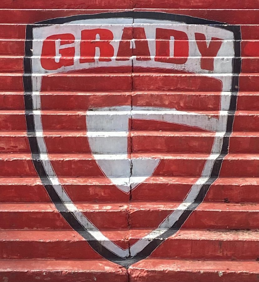
Following the school board’s decision to rename Grady to Midtown High School next school year, art teacher John Brandhorst is leading the redesign of the school’s logo and brand. However, this process is easier said than done.
Brandhorst and his continuously-growing advisory team of marketing professionals, students and faculty aims to roll out a new brand and logo by the end of May.
“Every little decision is a minefield,” Brandhorst said, regarding the complexity of the process. “A big thing that we want to get across is that this is a continuation. This is an evolution. This is not an erasure … I’ve seen a lot of change here … And this is yet one more change. It’s Grady 3.0.”
Karri Hobson-Pape is one of the many volunteers working with Brandhorst on the redesign. She served as the Vice President of Marketing and Communications at the University of Georgia for five years and has experience in marketing and communications for Emory University and Georgia Tech.
Brandhorst says she has been “indispensable to this process.”
“You need to be very thoughtful about how complex or simplistic the logo needs to be,” Hobson-Pape said on the intricacy of creating an effective logo. “It needs to convey both the spirit of the brand but also the functionality and the real usage needs at the organization.”
The rebranding process is defined by five main phases: assess, discover, define, create and activate. Each phase highlights a step in the process to achieve a final goal of a functional and authentic school brand.
“Through this process, the visual identity for Midtown High School will hopefully be distinctive, easy to use, recognizable and flexible for all the different parts of the institution,” Hobson-Pape said.
The “assess” phase was solidified earlier this month after a timeline was defined and an advisory team was put together. The process has now moved to the “discovery” phase. During this phase, Brandhorst and his team will hold Zoom community listening sessions where students, coaches, faculty, alumni and community members will have the opportunity to voice their opinions and visions for the rebrand.
“The discovery process is really important to understanding what the objectives are for a logo before you jump right into creating a design,” Hobson-Pape said. “Part of discovery is understanding what the interests and the needs are from the community and also looking across that whole landscape.”
Principal Dr. Betsy Bockman communicated the importance of these sessions in a letter to the Grady community, which was posted on the newly-launched Midtown High School Visual Identity & Brand website.
“During these sessions, we will explore the attributes that you believe Midtown High School possesses,” Dr. Bockman said. “These insights will guide the creative direction of the initial logo concepts.”
Hobson-Pape notes that the creation of a logo is more than just a design; it’s a “visual identity.”
“It’s a true system,” she said. “It’s a visual identity system, and by system what it means is that for every part of the organization, you’re building upon the equity that is established with that primary logo. So there will be one primary logo for Midtown High School. Then if someone else in the organization would like to have a logo, whether that’s an academic department or whether it’s a student services department, it can ladder up to the primary logo.”
Senior Joanna Baker is one of 10 students on Brandhorst’s core advisory team for the logo design. Like Hobson-Pape, she feels strongly that the logo should accurately represent the school’s new Midtown identity.
“I really want this to at least be a symbolic step of achieving that progress, [by] becoming more diverse and better representing the city that we live in and the neighborhood,” Baker said.
Baker believes the redesign is a broader step in the path to achieving change within the community.
“Hopefully, having this new name and this new logo will be a reminder to everyone that it’s our responsibility to keep pushing for these changes and really making this school into what we want it to be,” Baker said.
Art teacher V. Kottavei Williams hopes that the new logo and rebrand will allow all students to feel represented.
“Grady being located in the middle of the city, where you have people from all different races, genders and socioeconomic backgrounds, [means the logo should be] something that makes everybody feel like, ‘Yeah, that logo appeals to me because I’m recognized. I see myself in it,’” Williams said. “Something that’s neutral enough that everyone can see themselves in it, but also specific enough that they know it’s Midtown.”
Williams, however, recognizes the difficulty of creating a design that satisfies everyone.
“It’s a hard task to stand out and include everybody,” she said. “[I want to]…make sure when everybody looks at the logo, they see themselves reflected.”
Additional information about the rebranding efforts can be found HERE.

