Advisory team enters next phase of rebrand
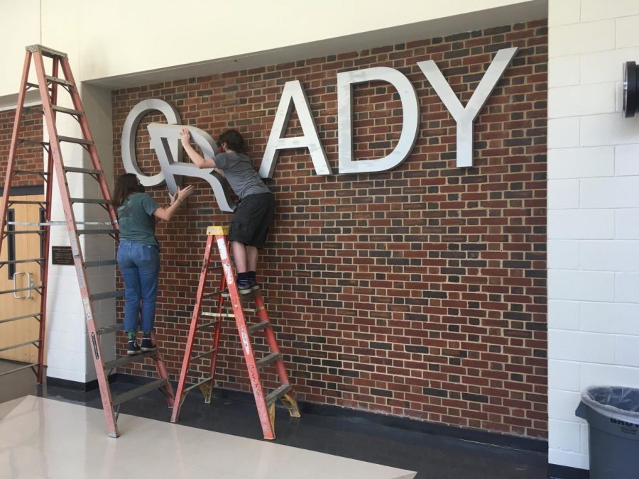
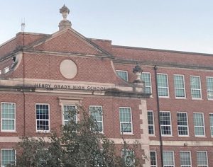
Student volunteers disassemble the Grady sign in the theatre lobby. The rebranding advisory team has finished conducting community listening sessions and has now opened up submissions for logo design. The first round of submissions should be submitted to John Brandhorst at [email protected] by March 14.
March 12, 2021
The Midtown High rebranding team conducted six listening sessions with teachers, students, sports staff and administration. These sessions aimed to foster dialogue about the rebrand with various stakeholders, to begin designing the visual brand as Grady transitions to the Midtown High School name.
Art teacher John Brandhorst, who is heading the rebranding process, says that an overlying theme of centrality emerged from the sessions.
“With the question: ‘How would you describe our school to people in another state?’ Every single group, without fail, came to the idea that we’re in the middle of everything,” Brandhorst said. “It’s the heart of the city, the center of the city, it came up again and again … And so that became a driving concept just because so many people brought it up.”
Rooting the logo and rebrand in the concept of centrality is “absolutely beautiful,” according to rebranding advisory board member Karri Hobson-Pape.
“Midtown High School is a collection of diverse perspectives; it’s central, with all these various influences in the city,” she said. “So when you think about it in a lot of different conceptual ways, it’s really kind of a beautiful way to describe what makes Midtown High School distinct. It really is cool.”
In some ways, the discussions left the team with more questions than answers, Brandhorst said.
“It was interesting to see the people split into different concerns because everything is political,” he said. “So, some people were thinking about the fact that knights are traditionally male and ‘What about women?’ The gender issue came up, and asking the question breeds more questions. Is a knight a proper mascot? Do we really need red? Which red? There’s not really a hard bottom to the conversation.”
Brandhorst noted that different stakeholders had concerns with varying concepts of the rebrand. He said the athletic department was particularly vocal in the process.
“The coaches had a lot to say because they have a very tangible interest in the color, and look and competitive presence of the team,” Brandhorst said. “That uniform concern is something that they talked about for a while. They were also the ones that pushed creating a distinction between a sports logo, a competitive spirit logo and then the academic whole-school logo.”
Athletic director Patrick Johnson was vocal about the department’s functional needs in a logo.
“Athletics has a specific use of logos,” Johnson said. “We use them, I don’t know if it’s more than any other group on campus, but we use them in everything we do, whether it’s facilities and uniforms and gear and promotional stuff. That branding is a really important part of an athletic program.”
Johnson emphasized the importance of a visual identity that reflects a competitive athletic program.
“Obviously, it needs to reflect the school as a whole, but it also needs to be particularly applicable to athletics and have an athletic use specifically,” he said. “And then obviously, the specifics of making sure we have the colors right and making sure the logo is repeatable on different things, whether its a track uniform or a volleyball hoodie, it needs to really stand out and let people know who we are and what Midtown High School is.”
Parent volunteer Brynn Bardacke, who has executive marketing experience for Google, Nike and Coca-Cola Company, took insights from the discovery listening sessions and constructed a Midtown High Creative Brief.
The brief outlines and articulates the strategy to guide possible design concepts. It “tells a story,” Bardacke said.
“It is a critical tool to be able to align the expectations of stakeholders,” Bardacke said. “It also serves as inspiration for the designers because, ultimately, they will have to come up with designs that meet those objectives.”
At the conclusion of the listening sessions and the finalization of the creative brief, the team opened up submissions for community logo design ideas. Finalists for round one will be chosen by March 18 and round two finalists by April 16.
The hardest question for designers is how can an identity be communicated through a logo, Bardacke said.
“We’ll have to see where these designers’ imaginations take us,” she said. “There are a lot of creative ways to communicate ‘the center of’… But people with a really great design sensibility can do that in a way that is overt enough to communicate that, but is not so literal that it is unimaginative.”
Bardacke emphasizes the importance of fostering community involvement with the design of the new Midtown logo.
“It’s critical to have, not only students but members of the community contribute because ultimately this is a reflection of that,” Bardacke said. “This is a community school. It’s a critical part of our neighborhood and of Atlanta, and my hope is that everybody in this community, whether it is a student or a community designer, would want to contribute because it ultimately is a part of their immediate neighborhood and community.”
![In his AP Comparative Government and American Government [Civics] classes, Rhodenbaugh surveyed his students on their opinion of the school name.](https://thesoutherneronline.com/wp-content/uploads/2020/09/AOBMTT56ylAQDAyv5OcJ66jtJardVgcasZEF6MLL-300x123.png)