Grady rebrands, deserts oval “G” logo
September 8, 2017
By Alex Langan and Charlie Toole
After an Atlanta Public Schools central office request for an examination of branding, Grady has changed its athletics logo and mascot name.
The ovular “G” logo has represented Grady athletics since 1968 and appeared to be in direct violation of both Green Bay Packers and University of Georgia copyrights. As a result, Grady has changed its logo to the shielded “G” logo designed by Grady students.
“Because we were proactive and have now changed it, we avoided a cease and desist,” Grady art teacher John Brandhorst said. “If they sent us a cease and desist, we would’ve had to tear up the new gym floor, discard all shirts and totally get rid of all uses of the old logo.”
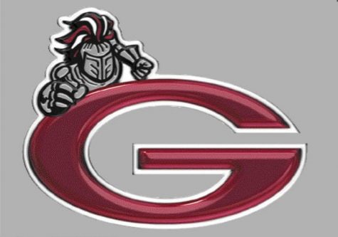
The logo, which was originally designed by the Packers in 1961, was first used by Grady in 1968 as a white ovular “G” with a cardinal background. It was then amended in 2005 by adding a knight mascot to the upper left corner as well as changing the color of the logo to cardinal with a silver or transparent background after some high schools across the country had their logos come under scrutiny by colleges.
This was still not enough to avoid possible copyright issues as the similarities were still evident.
“If when you first look at the logo, it bears enough similarity to another logo and makes you think of that logo, it is copyright infringement,” Brandhorst said.
The logo is owned by the Packers, but the University of Georgia was granted permission by Green Bay for use of the logo. Grady, along with many other high schools across the country, have been using this logo without proper permission.
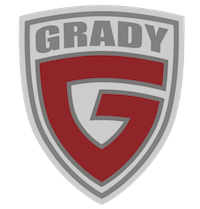
The shielded “G” has been used recently as the school logo for academics. In 2016, the logo was painted onto the stairs leading up to the courtyard between the two gyms. It is now the official logo for the school as a whole, although individual clubs and teams have permission to use their own logos.
“The new logo was designed in house and has already been used throughout the school,” Brandhorst said. “Some teams such as Robotics have their own logo, and they are free to keep using those.”
The mascot name, which has been the Grey Knights since the creation of the school in 1947, has been changed to just the Knights in order to avoid association with the Confederate Army, whose military uniform displayed the color.
When the name of the mascot was under fire, the committee in charge of the rebrand had been considering a whole new mascot for Grady, but were met with heavy opposition from alumni, because the mascot has been synonymous with the school’s athletics for decades.
In order to keep things simple and not disrupt any relationship with alumni, the school settled on the minor change to the mascot’s name.
“Some different names were considered, like the redtail [hawk] that you see flying around,” Brandhorst said. “We decided to keep the Knight because alumni came forward and opposed a huge change.”